2062
A sneak peek at fonts in perpetual progress. One day on Future Fonts or some other sources of WIP fonts near you!
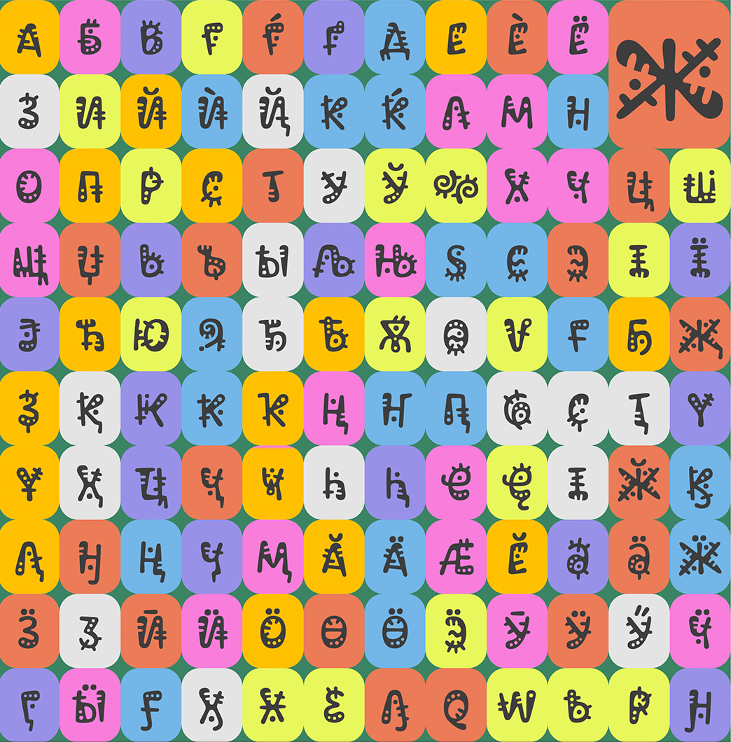
2024
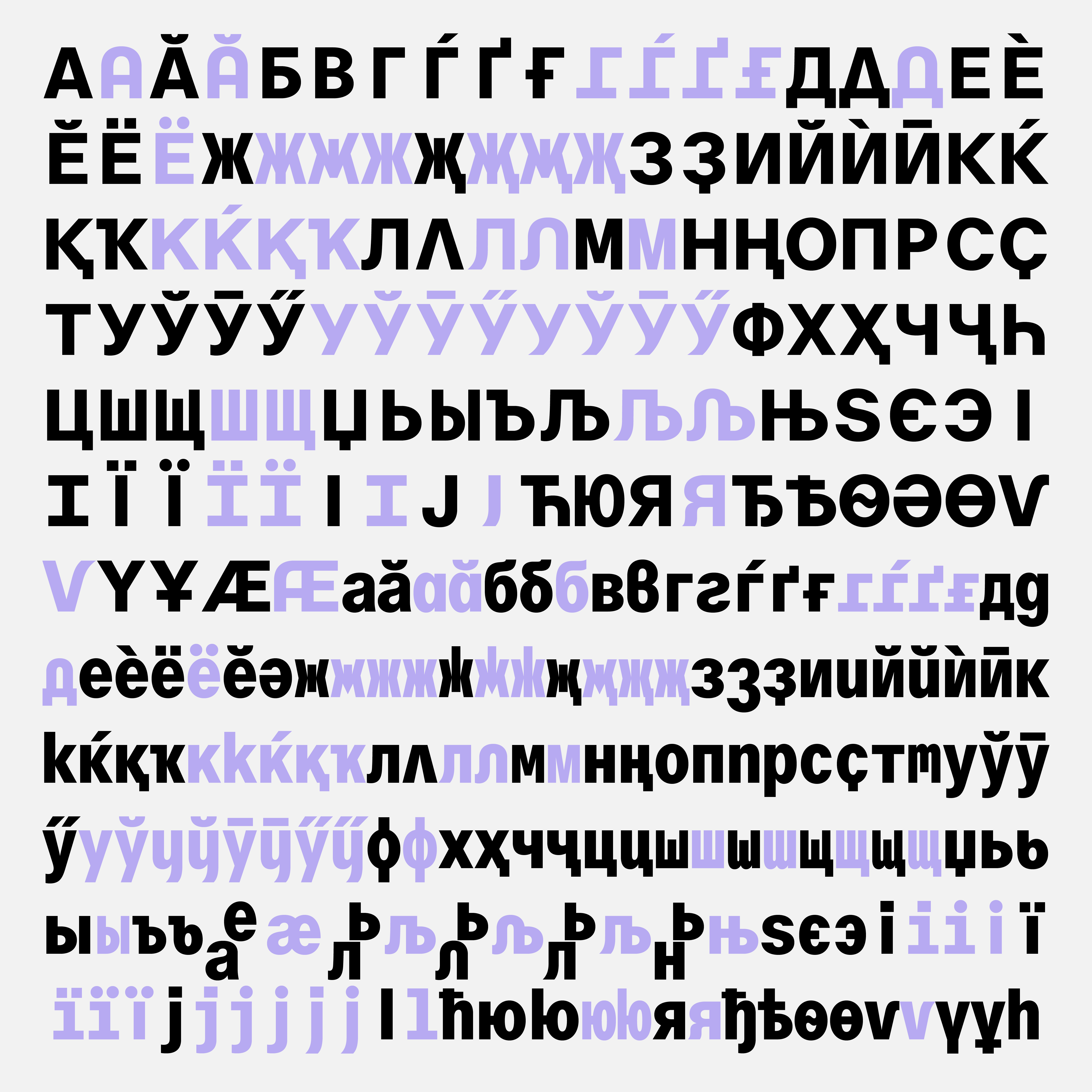
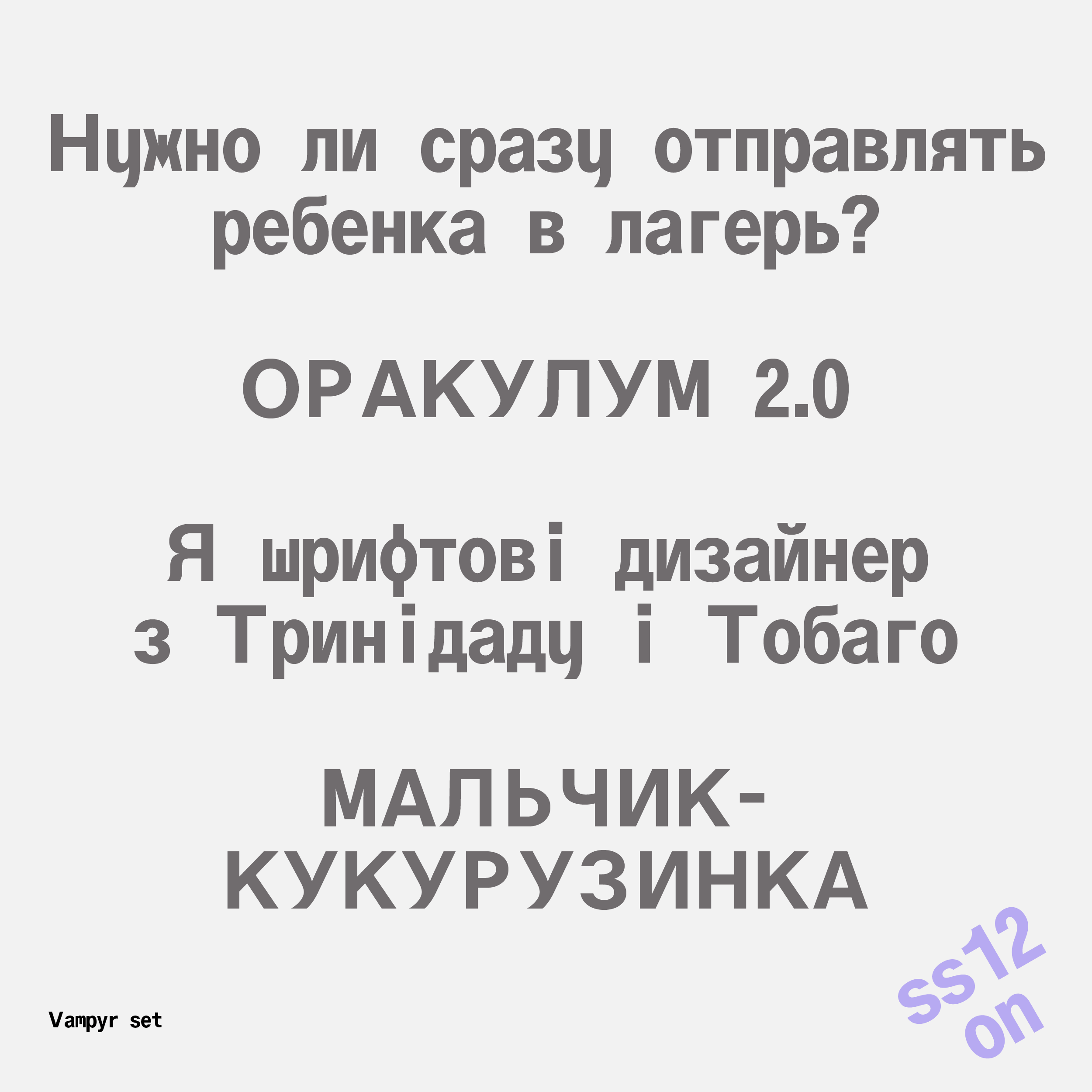
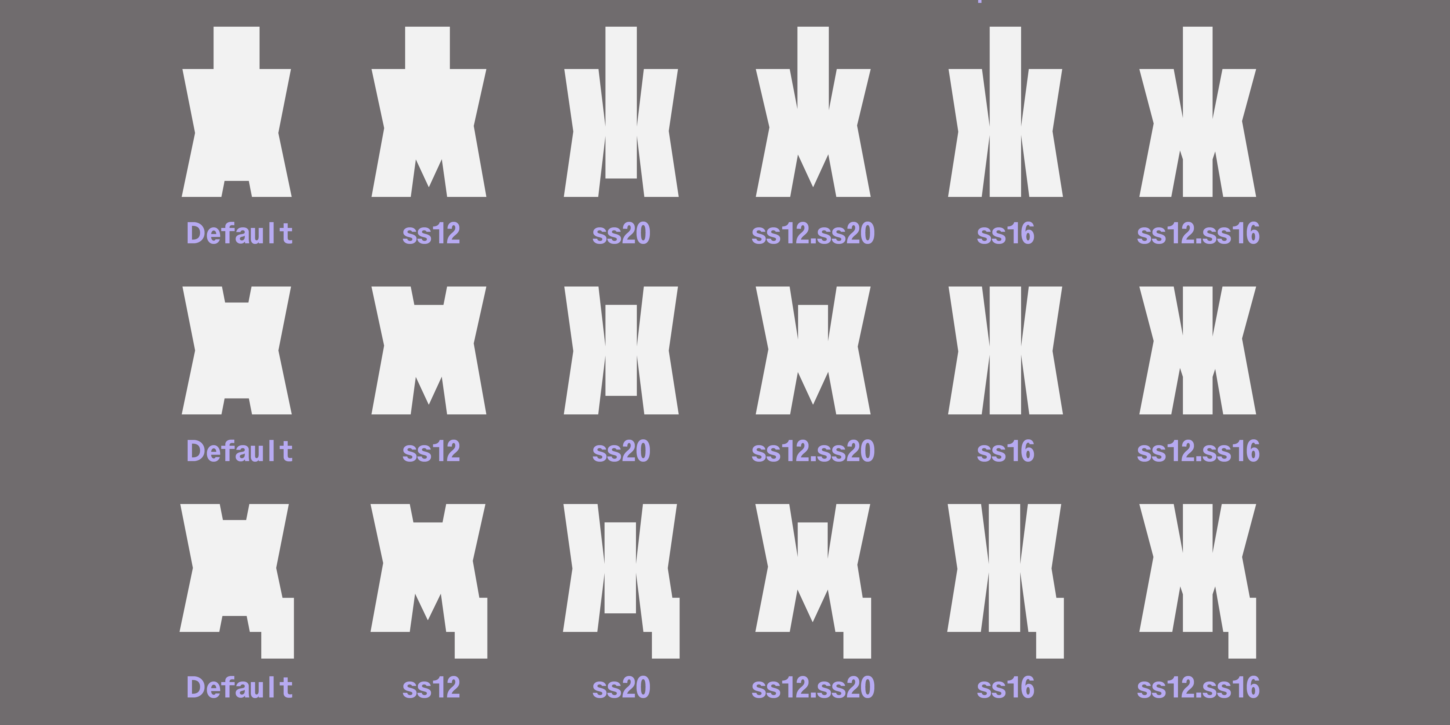
I used to think stylistic sets were for the indecisive. Until I met ABC Oracle. Naturally I went all in pushing Cyrillic as far as it would go, and then a little further. That resulted in a surplus of unusual shapes, some of which you can see here.
And even though stylistic set support is still sketchy in most apps, every single one of them is worth the suffering here. Pick your poison!
2019
When variable fonts were still in their infancy, Lizy and Travis invited Ethan and me to help with Kablammo production and add Cyrillic to it. Kablammo ended up teaching us just about everything there was to learn about variable fonts at the time.
It’s a fantastic typeface that’s available for free through Google Fonts. Please use it. Or at least go explore.
2025
While Latin type design continues to expand in freedom, Cyrillic feels increasingly dogmatic and divisive. Certain letter constructions are embraced or rejected depending on school or region, sometimes dismissed as “unprofessional” or “foreign”. This narrowing of perspective saddens me deeply, as I care greatly about the Cyrillic script and its richness.
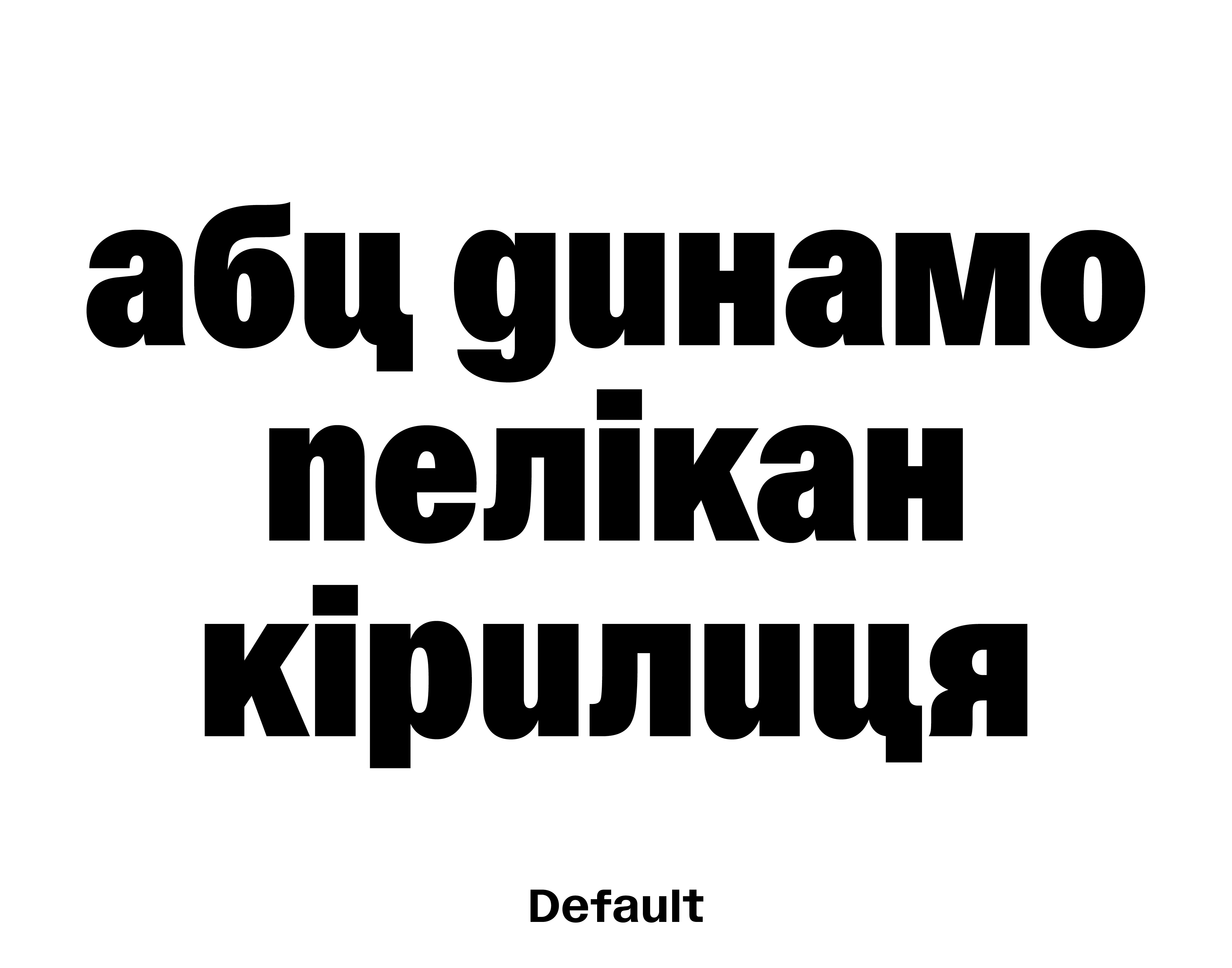
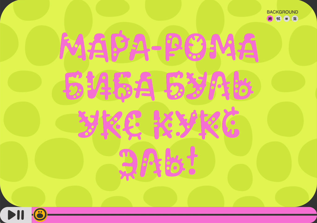
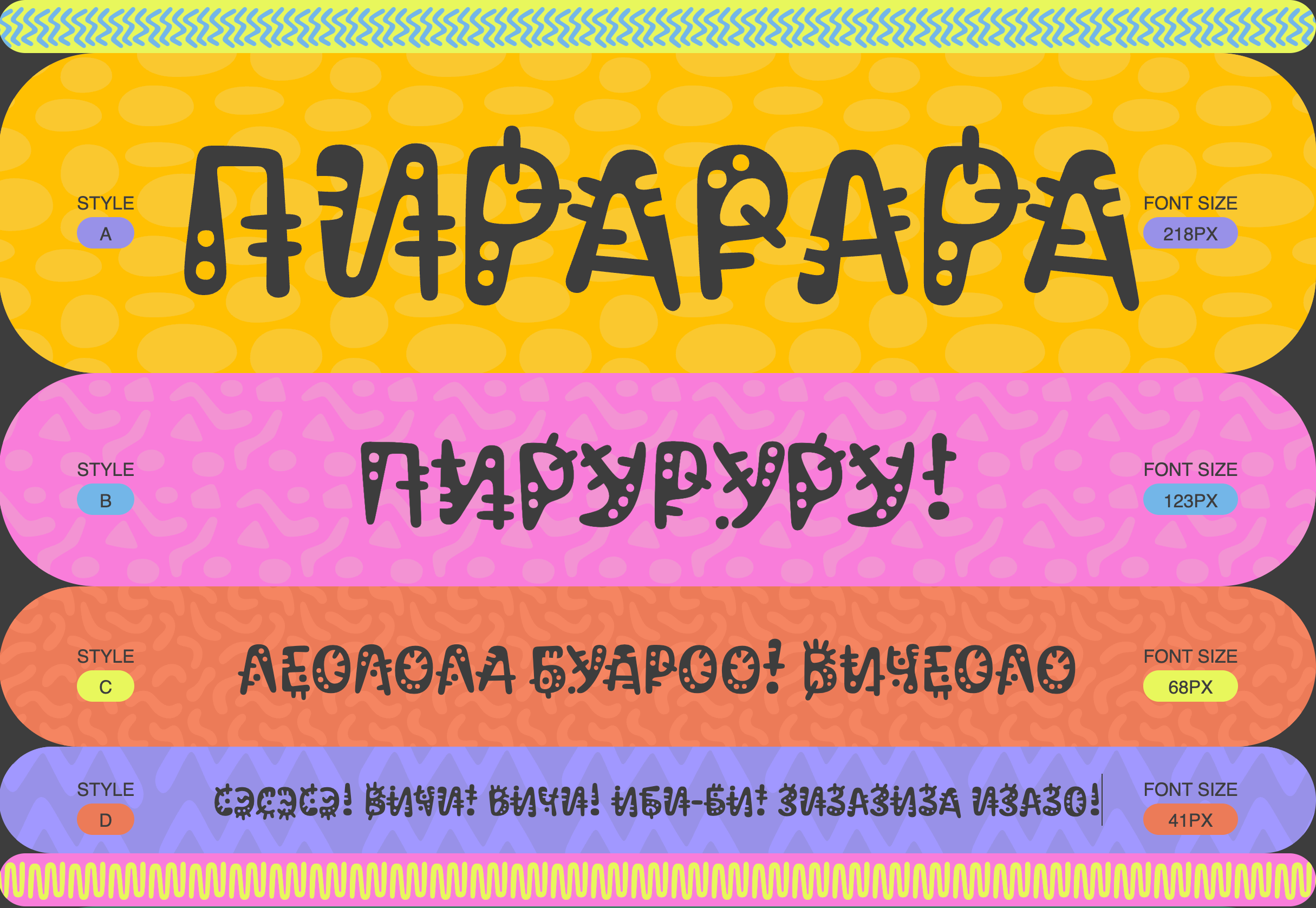
ABC Pelikan gave me a great excuse to explore “unconventional” Cyrillic shapes. The script traditionally shows little distinction between upper- and lowercase forms – inconvenient when the core idea of the typeface is not one but two unicase sets. My solution was to tap into another Cyrillic tradition: handwritten forms. They brought the rhythm and contrast I was looking for.
What they might have also brought is disagreement. For those who prefer their letters well-behaved, Stylistic Set 6 has you covered, I called it Typographic.
The result is a typeface with more than ten distinct voices in Cyrillic. A rare bird!